E-commerce
Storyblok’s official e-commerce integrations allow content creators to select products and categories from an existing e-commerce backend directly from the Visual Editor.
The e-commerce integrations are field plugins that fetch data directly from the e-commerce platform and access it in the Visual Editor. After one or more products or categories have been selected, a subset of the available data from the e-commerce platform is stored in the story object. The amount of data that is stored is limited deliberately, as the data is only intended as a reference. When fetching stories using Storyblok’s Content Delivery API, the included product and/or category IDs can be used for a subsequent API request, fetching the required data directly from the e-commerce platform. This approach ensures that the most up-to-date data is retrieved.
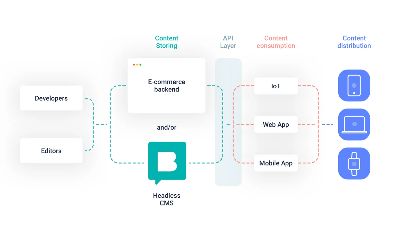
A visual representation of developers and editors using an e-commerce backend and Storyblok to distribute content across multiple channels through an API layer.
Official integrations
Section titled “Official integrations”Our official e-commerce integrations are developed, maintained, and supported in-house.


Community integrations
Section titled “Community integrations”The following e-commerce integrations are created and maintained by our developer community. Support is provided by the creator, not our team.


Magento 2 module by Wind & Kite.
Setup and application
Section titled “Setup and application”The following steps describe generically how to set up an official e-commerce integration and retrieve data. For more specific setup instructions, please refer to the available integrations linked above.
In the Block Library, create a new nestable block with the technical name featured_products. Add the following fields to the schema:
title: Textproducts: Plugin
In the Custom Type dropdown of the products field, select one of the e-commerce integrations, e.g. sb-shopify or sb-centra. In the Source section, provide the API credentials of your e-commerce platform.
The API response from the single-story endpoint includes the product data in the items array of the featured_products field of the story.
{ "featured_products": { "items": [ { "id": "gid://shopify/Product/7788021645465", "sku": "product-001", "name": "Product 001", "type": "product", "image": "https://cdn.shopify.com/s/files/1/0501/4120/0537/files/product-001.jpg", "handle": "product-001", "variants": false, "description": "A description for Product 001." }, // ... ], "plugin": "sb-shopify" }}The following example in JavaScript illustrates how product data can be fetched on the frontend using subsequent API requests to Storyblok and, in this example, Shopify.
import { storyblokInit, apiPlugin } from '@storyblok/js'import Client from 'shopify-buy'
const { storyblokApi } = storyblokInit({  accessToken: 'your-storyblok-access-token',  use: [apiPlugin],})
const shopifyClient = Client.buildClient({  domain: 'your-shop-name.myshopify.com',  storefrontAccessToken: 'your-storefront-access-token',})
try {  const { data } = await storyblokApi.get('cdn/stories/home', {    version: 'draft',  })
  const { story } = data
  const productId = story.content.body[0].featured_products.items[0].id
const product = await shopifyClient.product.fetch(productId) console.log(product)} catch (error) { console.log(error)}Moving beyond the fundamentals, several additional approaches with or without using Storyblok’s e-commerce integrations are conceivable, for example:
- Fetch a selection of products from a category ID selected in Storyblok and add filtering methods provided by the e-commerce API to enhance the UX
- Allow content creators to overwrite product metadata, such as the title or description, directly in Storyblok
- Manually map a single product to a dedicated product story
- Fetch products by matching story slugs, circumventing the requirement to manually select a product in a designated field (this approach can be particularly attractive when dealing with large quantities of products)
- Create blocks without designated e-commerce fields that automatically render a selection of products based on metrics (e.g., best-selling, latest, most expensive) or meta attributes (e.g., tags, collections, categories)
Related resources
Section titled “Related resources”Was this page helpful?
This site uses reCAPTCHA and Google's Privacy Policy. Terms of Service apply.
Get in touch with the Storyblok community