Add a headless CMS to Preact in 5 minutes
Storyblok is the first headless CMS that works for developers & marketers alike.
This short tutorial will look at integrating Storyblok into a Preact application. We will learn how we get the data from Storyblok and how we enable Storyblok Bridge to preview live changes in the Visual Editor.
You can find the final code for this tutorial in this repository.
Requirements
Here are a few requirements to follow this tutorial:
- Understanding of Preact and Javascript.
- Node.js LTS version (npm or yarn installed).
- A Storyblok App account for creating a project in Storyblok.
Project Setup
Let’s start by creating a new Preact Project. We are going to use Vite for setting up our development environment.
# npm 6.x
npm create vite@latest my-preact-app --template preact
# npm 7+, extra double-dash is needed:
npm create vite@latest my-preact-app -- --template preact
# yarn
yarn create vite my-preact-app --template preact
Now we also need to install a few more packages. First, vite-plugin-mkcert (opens in a new window) will make our development server run on HTTPS. This is required for using Storyblok V2. We also need to install @storyblok/js (opens in a new window), Storyblok's official JavaScript SDK.
cd my-preact-app
# npm
npm install vite-plugin-mkcert @storyblok/js
# yarn
yarn add vite-plugin-mkcert @storyblok/js
Once the above packages are installed, we need to update our vite.config.js file to run our dev server on HTTPS.
import { defineConfig } from "vite";
import preact from "@preact/preset-vite";
import mkcert from "vite-plugin-mkcert";

// https://vitejs.dev/config/
export default defineConfig({
  plugins: [preact(), mkcert()],
});
Once our vite.config.js file looks like the above we can start our development server.
npm run dev
# yarn dev
It should automatically open a tab in the browser with the URL https://localhost:5173/ (opens in a new window), or we can manually go to the URL after the project starts running. You should see this screen:
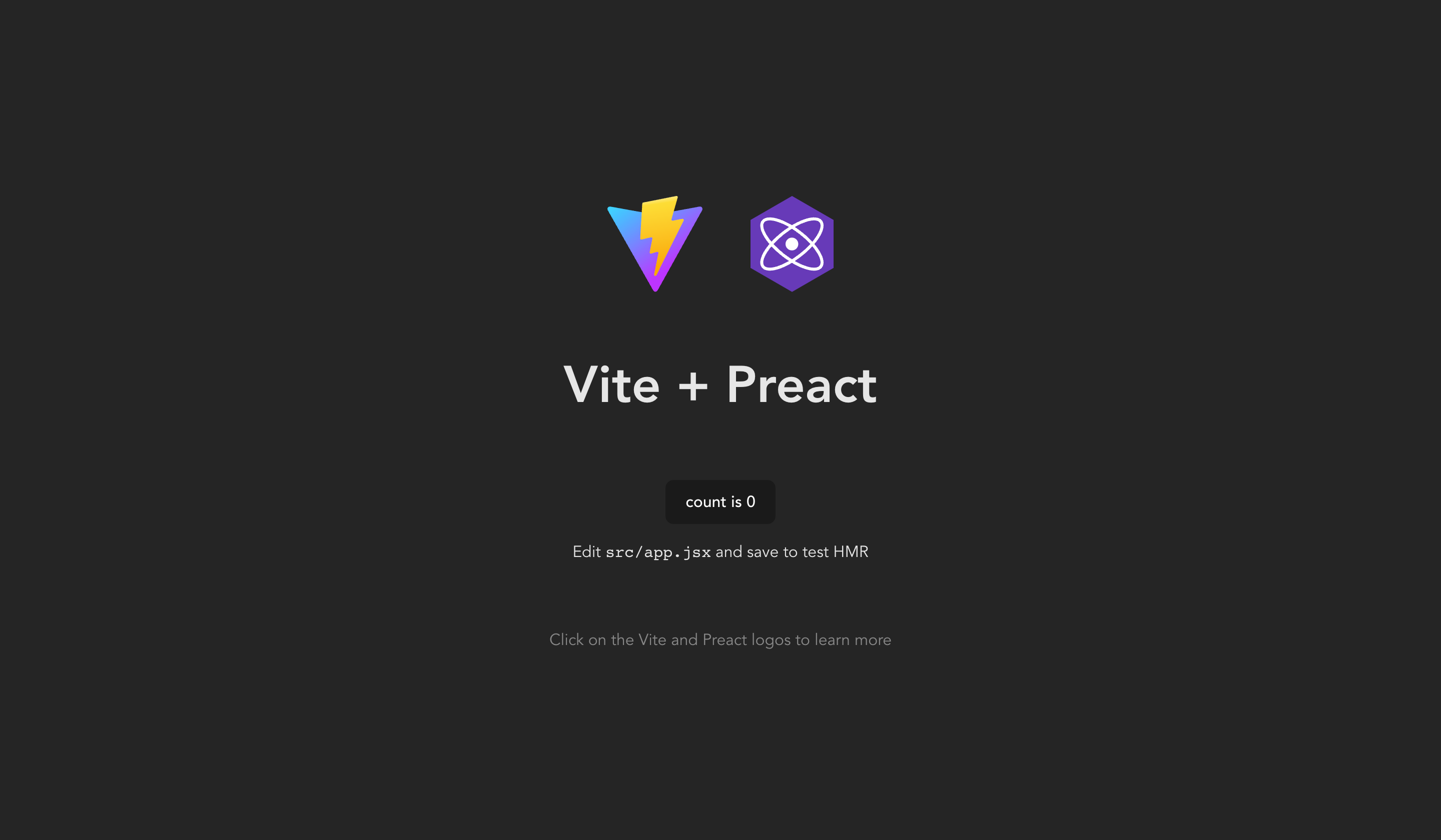
Fresh Vite + Preact Project
Space Configuration
Now create a new space in the Storyblok App by clicking "Create New". Select the first option to start from scratch {1} and give it a name {2}. Then we can hit "Create space" {3}.
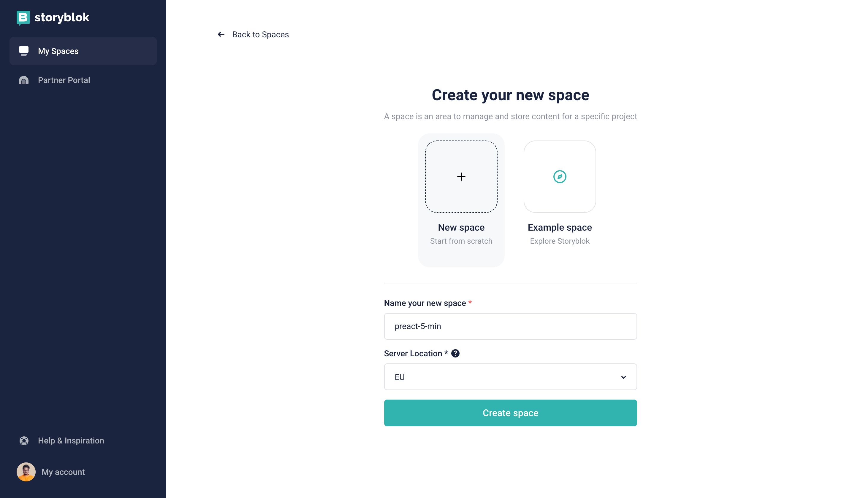
Creating a new space in Storyblok
Every Storyblok space has some sample content and components. However, we need to configure our Storyblok space so the visual editor gets the live preview of our frontend Preact App. For this, go to "Settings" {1}, "Visual Editor" {2}, set the "Location (default environment)" {3} to https://localhost:5173/, and finally, hit the "Save" button {4}.
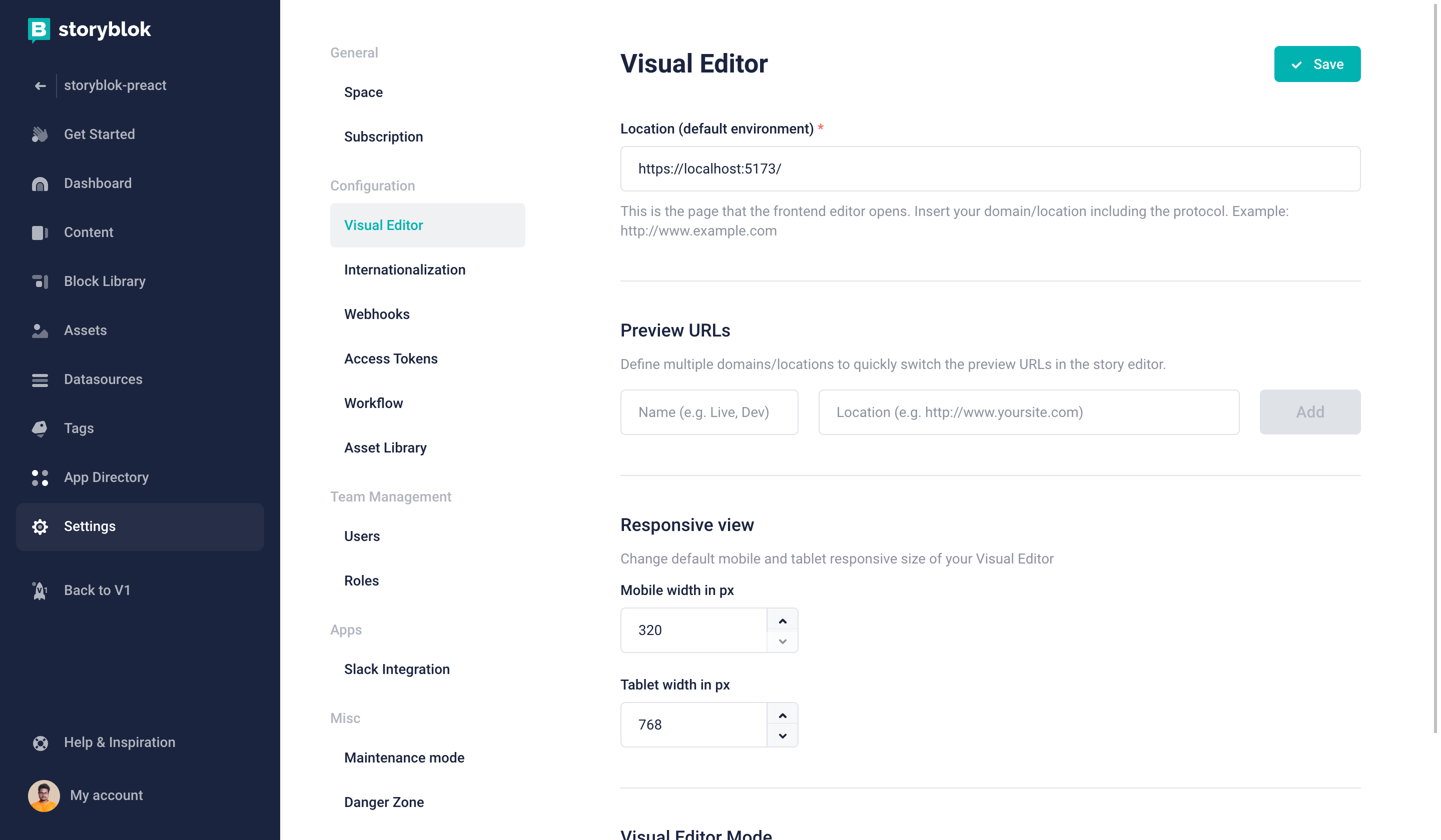
Setting the default environment in the Storyblok Settings
Now let’s go to the Home Page from the Content section. Click on the "Content" {1} and "Home Page" {2}. Once the page opens, we can see our Preact App preview.
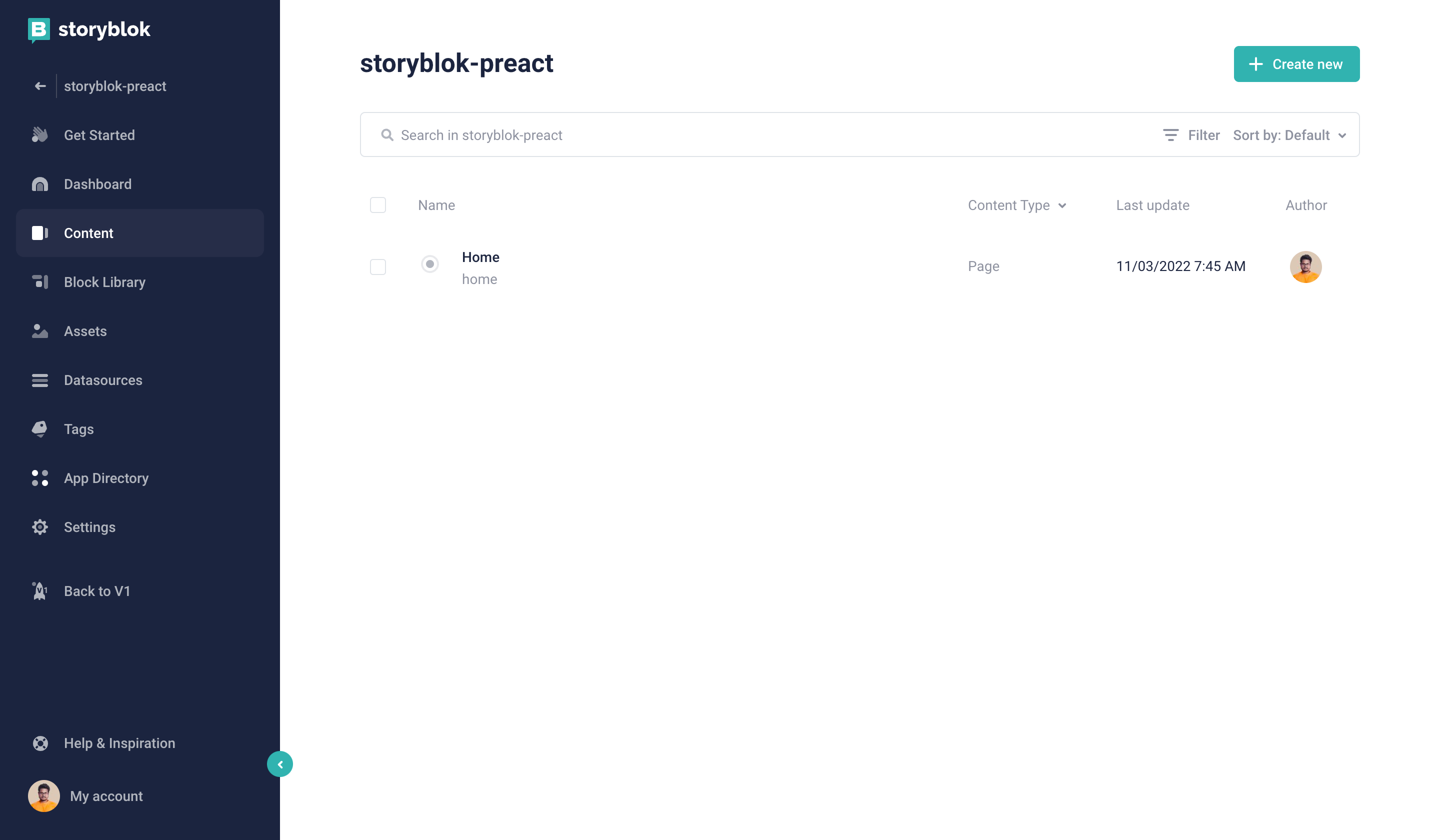
Navigating to the home page
On the right-hand side, we can see two blocks Storyblok provides. Shortly we will learn how we can create Preact components that will visually represent these two blocks. But before we do that we need to update the Real Path of this story. Click on the "Entry Configuration" {1} and set the "Real Path" {2} to / . Finally, press "Save & Close" {3}.
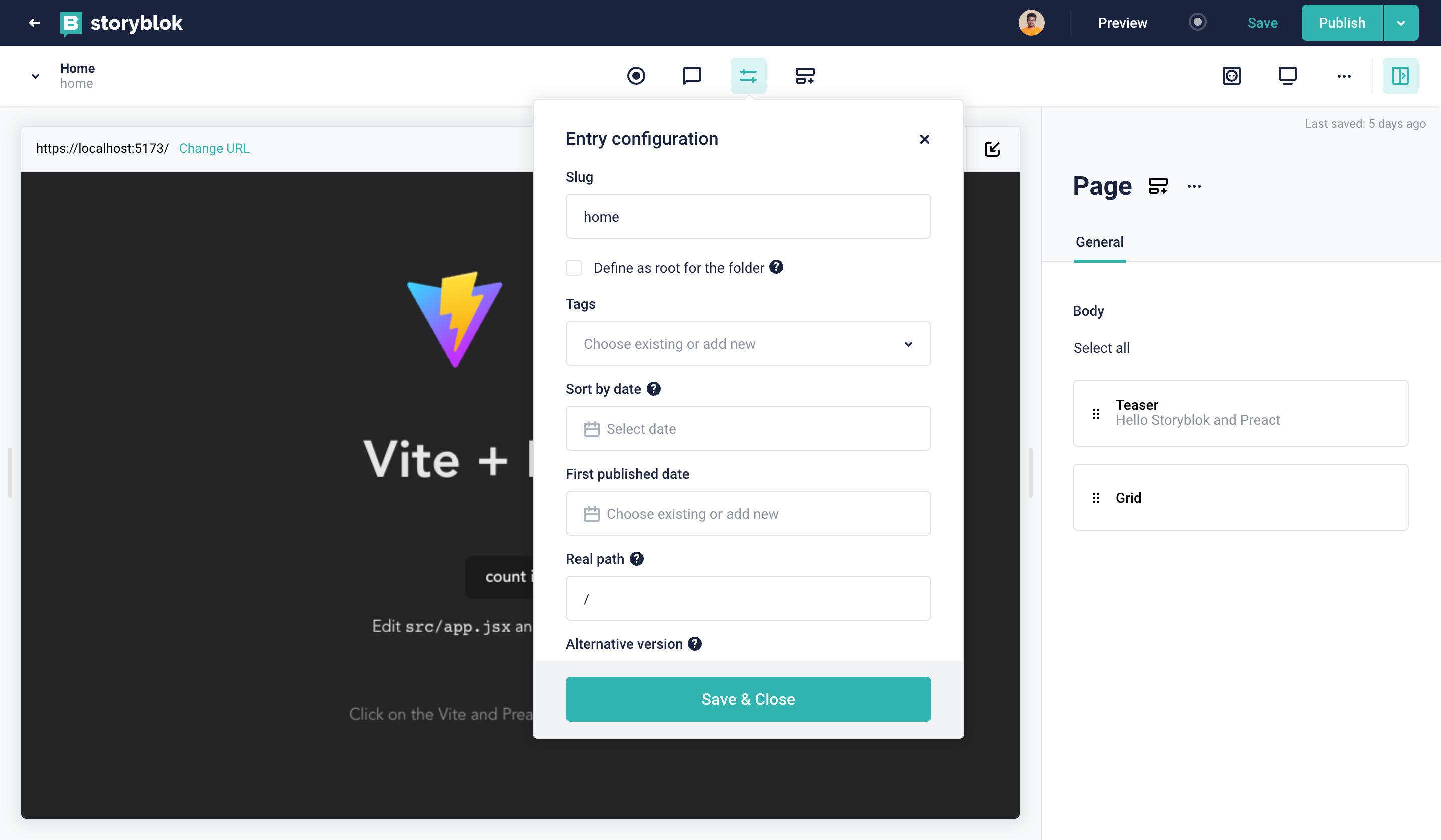
Update home page entry configuration
Connect Preact to Storyblok
Before we start, let's create a helper function that will make our life much easier.
import { useState, useEffect } from "preact/hooks";
import { registerStoryblokBridge as registerSbBridge } from "@storyblok/js";
import { storyblokInit as sbInit } from "@storyblok/js";
export { default as StoryblokComponent } from "./StoryblokComponent";
export { storyblokEditable, useStoryblokBridge } from "@storyblok/js";
export { apiPlugin, registerStoryblokBridge } from "@storyblok/js";
export { renderRichText } from "@storyblok/js";

let storyblokApiInstance = null;
let componentsMap = {};

export const useStoryblok = (slug, apiOptions = {}, bridgeOptions = {}) => {
  let [story, setStory] = useState({});

  if (!storyblokApiInstance) {
    console.error(
      "You can't use useStoryblok if you're not loading apiPlugin."
    );

    return null;
  }

  registerSbBridge(story.id, (story) => setStory(story), bridgeOptions);

  useEffect(() => {
    async function fetchData() {
      const { data } = await storyblokApiInstance.get(
        `cdn/stories/${slug}`,
        apiOptions
      );
      setStory(data.story);
    }
    fetchData();
  }, [slug]);

  return story;
};

export const useStoryblokState = (
  initialStory = {},
  bridgeOptions = {},
  preview = true
) => {
  let [story, setStory] = useState(initialStory);
  if (!preview) {
    return initialStory;
  }
  useEffect(() => {
    registerSbBridge(story.id, (newStory) => setStory(newStory), bridgeOptions);
    setStory(initialStory);
  }, [initialStory]);
  return story;
};

export const useStoryblokApi = () => {
  if (!storyblokApiInstance) {
    console.error(
      "You can't use getStoryblokApi if you're not loading apiPlugin."
    );
  }

  return storyblokApiInstance;
};

export { useStoryblokApi as getStoryblokApi };

export const getComponent = (componentKey) => {
  if (!componentsMap[componentKey]) {
    console.error(`Component ${componentKey} doesn't exist.`);
    return false;
  }
  return componentsMap[componentKey];
};

export const storyblokInit = (pluginOptions = {}) => {
  const { storyblokApi } = sbInit(pluginOptions);
  storyblokApiInstance = storyblokApi;
  componentsMap = pluginOptions.components;
};import { getComponent } from "./storyblokHelper";
const StoryblokComponent = ({ blok, ...restProps }) => {
if (!blok) {
console.error("Please provide a 'blok' property to the StoryblokComponent");
return <div>Please provide a blok property to the StoryblokComponent</div>;
}
const Component = getComponent(blok.component);
if (Component) {
return <Component blok={blok} {...restProps} />;
}
return <div></div>;
};
export default StoryblokComponent;We created multiple helper functions and re-exported a few functions from @storyblok/js in the above two files. Let's quickly take a look at few important functions and what they do.
| Name | Description |
|---|---|
| storyblokInit | This function will be used at the top label of our application to connect with storyblok. We will define our access token and all the components here. |
| storyblokEditable | This function will help make our components editable in Storyblok visual editor. |
| StoryblokComponent | This function will map all of our Storyblok components with Preact component. |
| useStoryblok | This function will help us to get the content based on the current slug. |
Let's begin the fun part
Connect the Preact Application to Storyblok with the help of the above helper function. We are going to use two things from the above in the main.jsx file storyblokInit and apiPlugin. We need to add the following code to the main.jsx file.
...

import { storyblokInit, apiPlugin } from "./storyblok/storyblokHelper";
storyblokInit({
  accessToken: "YOUR_PREVIEW_TOKEN",
  use: [apiPlugin],
  apiOptions: {
  https: true,
  region: "eu",
 },
  components: {},
});

...
Setting the correct region
Depending on whether your space was created in the EU, the US, Australia, Canada, or China, you may need to set the region parameter of the API accordingly:
eu(default): For spaces created in the EUus: For spaces created in the USap: For spaces created in Australiaca: For spaces created in Canadacn: For spaces created in China
Here's an example for a space created in the US:
apiOptions: {
  region: "us",
},Note: For spaces created in any region other than the EU, the region parameter must be specified.
storyblokInit will allow us to set up the connection with the space and load the Storyblok Bridge, which helps us see real-time changes when editing the content in Storyblok. The apiPlugin helps us retrieve the data.
The storyblokInit function also has a component parameter. Here, we have to declare all the Preact components according to the ones we have in our space. These components are dynamically rendered with the StoryblokComponent which we will see shortly.
It's a common pattern to name the Preact components the same as in our Storyblok space.
Before we create our components we also need to get the preview token and place the value in accessToken field. To do this, go to "Settings" {1}, "Access Tokens" {2}, and copy the "Preview" access token {3}.
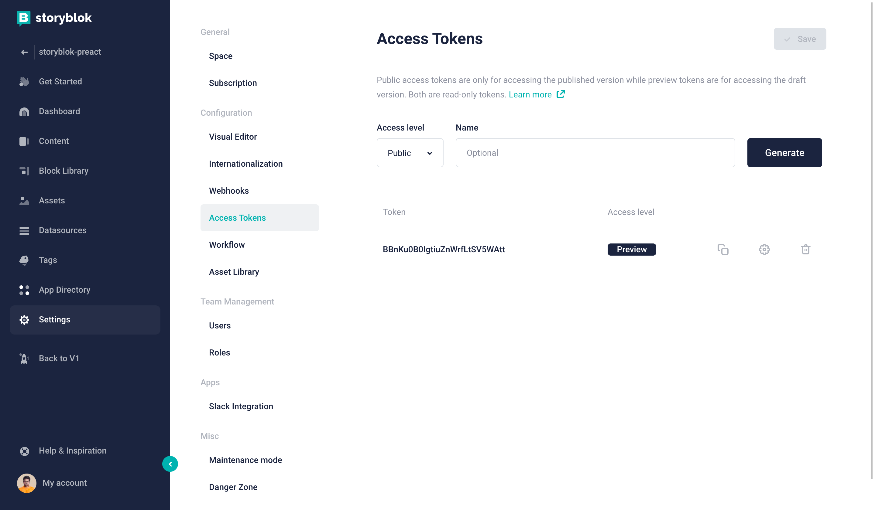
Getting the preview access token for our project
Now that we have the preview access key, we can load the data dynamically based on the current page. Let's make a few updates in our App.jsx file.
import { useStoryblok, StoryblokComponent } from "./storyblok/storyblokHelper";
function App() {
  let slug =
    window.location.pathname === "/"
      ? "home"
      : window.location.pathname.replace("/", "");
  const story = useStoryblok(slug, { version: "draft" });
  if (!story || !story.content) {
    return <div>Loading...</div>;
  }
  return <StoryblokComponent blok={story.content} />;
}
export default App;
In order to load dynamic data based on the page we need to get the current slug. After we get the slug we are using useStoryblok from our helper function. This useStoryblok takes a slug:string as the first and apiOptions:object as the second parameter. It can also take a third and last optional parameter bridgeOptions:object.
| Parameter | Description |
|---|---|
| slug* | The first parameter of type string. Slug of the required story |
| apiOptions* | The second parameter of type object, for configuring the API options. |
| bridgeOptions | This is an optional parameter of type object, for customizing the bridge options. |
We also see StoryblokComponent in action here. We can pass the content for a story with blok props. And it's going to map the Preact components we created according to our space and listed in storyblokInit.
In Storyblok, all the content is structured as components. As we already have some components created in our space, let’s create those in our Preact app. This will allows us to reuse the components dynamically.
Creating Components
When we create a new space, the default components are: Page, Teaser, Grid and Feature. Now let's create these components in our app.
In the components folder:
import { StoryblokComponent, storyblokEditable } from "../storyblok/storyblokHelper";
const Page = ({ blok }) => (
  <main {...storyblokEditable(blok)}>
    {blok.body
      ? blok.body.map((blok) => (
          <StoryblokComponent blok={blok} key={blok._uid} />
        ))
      : null}
  </main>
);
export default Page;
In the Page component, we are using storyblokEditable function from our helper function. It will allow us to mark the preact component as editable in the Storyblok Visual Editor. With the help of this function, we can click the component in the Visual Editor and easily edit them. Hence we will use this for all the Storyblok components.
import { storyblokEditable } from "../storyblok/storyblokHelper";
const Teaser = ({ blok }) => {
  return (
    <h2 style={{ textAlign: "center" }} {...storyblokEditable(blok)}>
      {blok.headline}
    </h2>
  );
};
export default Teaser;import { StoryblokComponent, storyblokEditable } from "../storyblok/storyblokHelper";
const Grid = ({ blok }) => {
return (
<div
style={{ display: "flex", justifyContent: "space-around" }}
{...storyblokEditable(blok)}
className="grid"
>
{blok.columns.map((blok) => (
<StoryblokComponent blok={blok} key={blok._uid} />
))}
</div>
);
};
export default Grid;import { storyblokEditable } from "../storyblok/storyblokHelper";
const Feature = ({ blok }) => (
<div {...storyblokEditable(blok)} className="column feature">
{blok.name}
</div>
);
export default Feature;Now we have all the Preact components the same as in our Storyblok space we need to add these in storyblokInit in main.jsx.
import { render } from "preact";
import App from "./app";
import "./index.css";
import Page from "./components/Page";
import Grid from "./components/Grid";
import Feature from "./components/Feature";
import Teaser from "./components/Teaser";
import { storyblokInit, apiPlugin } from "./storyblok/storyblokHelper";
const components ={
  page: Page,
  teaser: Teaser,
  feature: Feature,
  grid: Grid,
}
storyblokInit({
  accessToken: "YOUR_PREVIEW_TOKEN",
  use: [apiPlugin],
  components,
});
render(<App />, document.getElementById("app"));
And that’s all! We should be able to see our content in the Visual Editor, now that we’ve unlocked the power of live editing. We can start playing with the content and see live changes. It should look something like this:
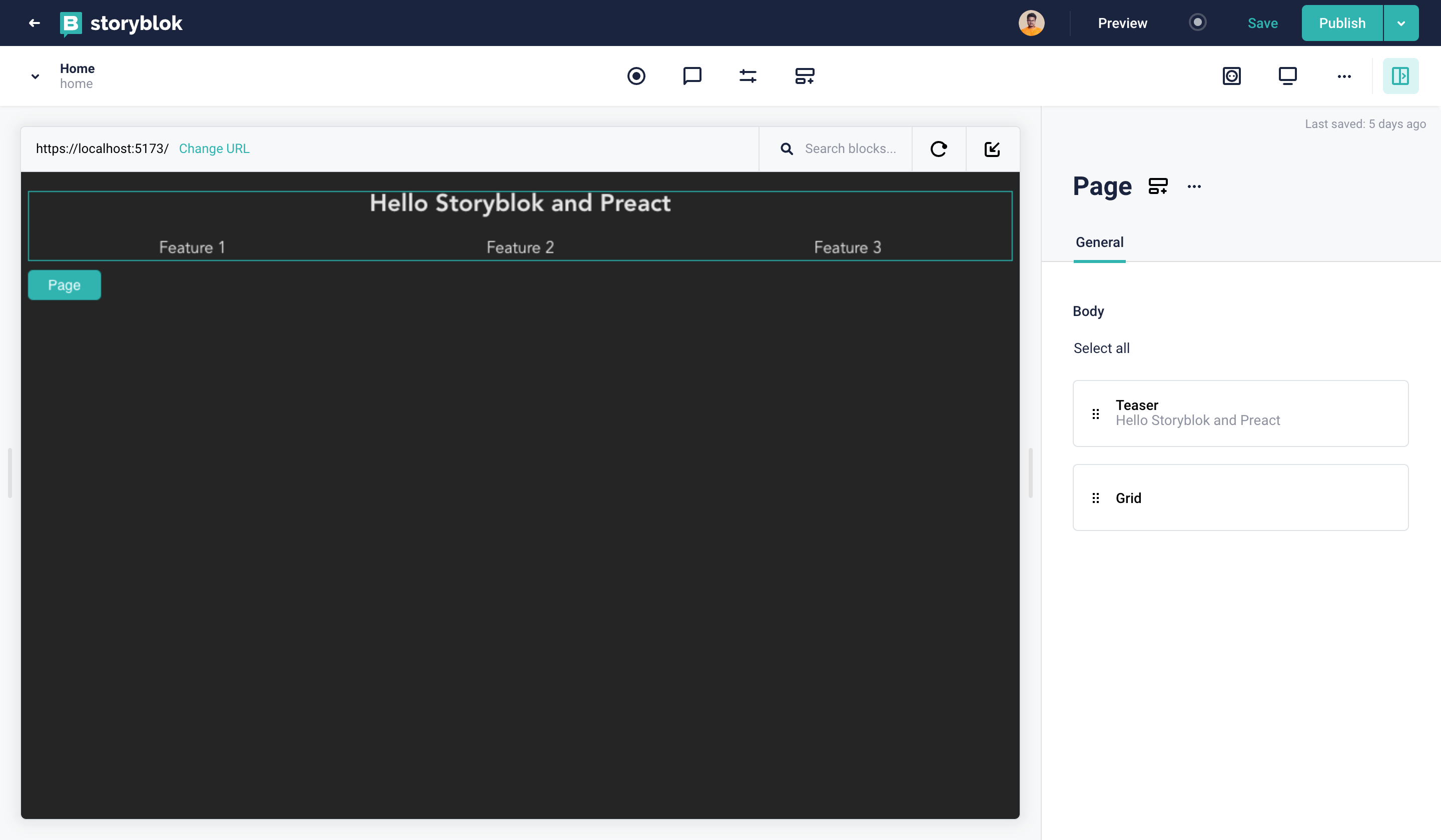
Live editing in storyblok
Wrapping Up
In this tutorial, we saw an overview of creating and integrating a Preact Application with Storyblok. Additionally, we learned how to use the data and enable the real-time Visual Editor.
| Resource | Link |
|---|---|
| Demo Repository | https://github.com/storyblok/storyblok-preact-boilerplate |
| Preact Docs | https://preactjs.com/guide/v10/getting-started |
| Storyblok Visual Editor | https://www.storyblok.com/docs/guide/essentials/visual-editor |
| Storyblok JS Bridge | https://www.storyblok.com/docs/libraries/js/preview-bridge |
